Visit
Fintech

GoldOn case study

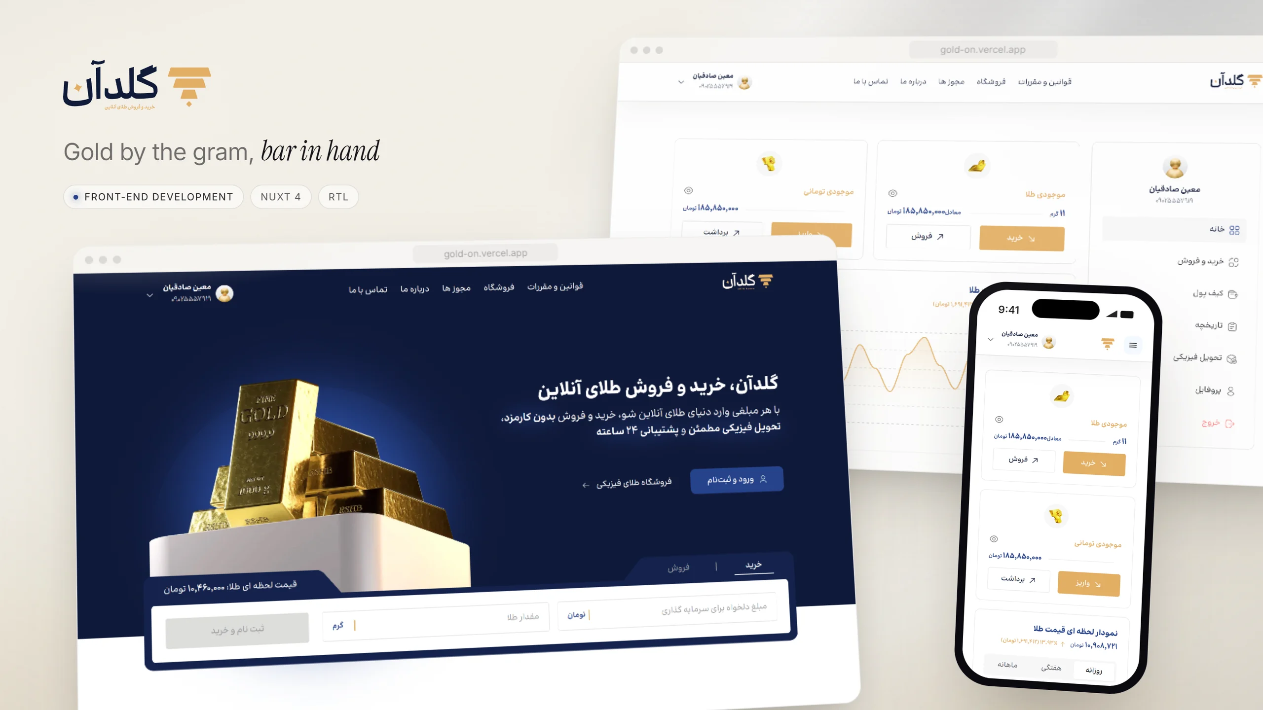
A right-to-left Persian site for buying and selling physical gold, which I built on my own — from a navy-and-gold landing page with the buy form under the hero to the first pages of the member dashboard.

Role
Front-end developer
Stack
Nuxt 4 · Tailwind 4 · Nuxt UI · ApexCharts
Year
2025–2026
GoldOn — project overview

01Overview

GoldOn sells physical gold online: buy and sell by the gram, hold a balance in gold and one in toman, and order bars and coins from a shop. I built the front end alone — the landing page, the shop and product pages, licences, about, contact and rules, a sign-up flow that runs from phone number and one-time code to identity and a Jalali date of birth, and the first two pages of the dashboard. It is a front-end build: the balances and prices in these shots are sample data, not a connected account.
02The challenge

A gold buyer holds two balances that mean different things — grams of metal and toman of cash — and moves between them in both directions. The interface has to keep the two apart without making either feel secondary, show what a trade costs before the button is pressed, and read naturally right to left, in Persian numerals, on a phone as well as a desktop.

GoldOn — Two balances, side by side

03Two balances, side by side

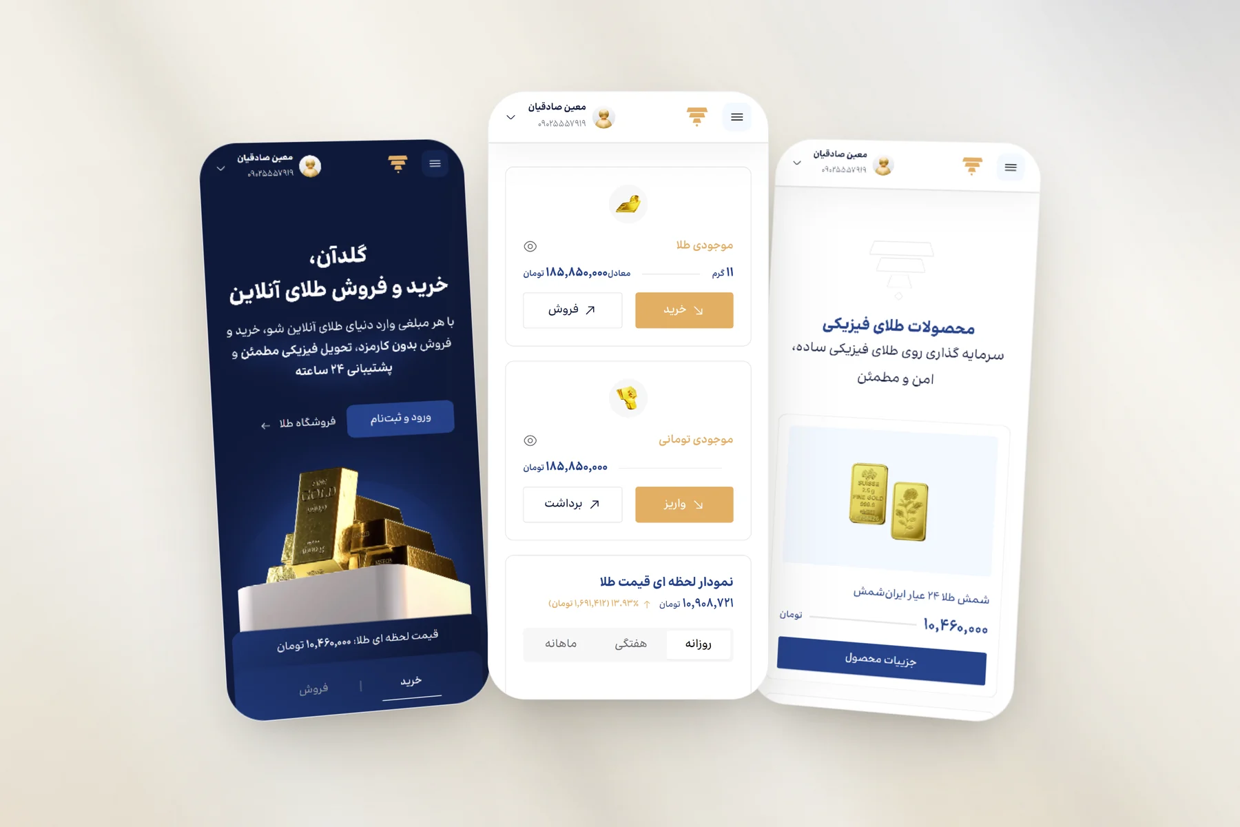
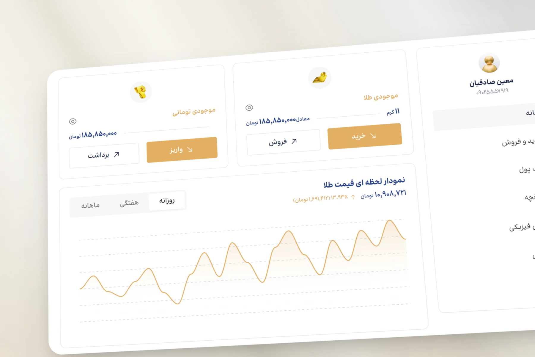
The dashboard home shown here gives each balance its own card: gold in grams with its toman equivalent on the same line, and cash in toman. Each card carries the two actions that belong to it — buy and sell for the gold, deposit and withdraw for the cash — and under them the gold price chart switches between daily, weekly and monthly ranges.

GoldOn — A form that starts where you do

04A form that starts where you do

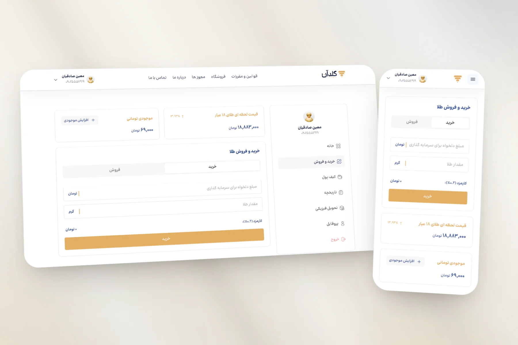
The trade page in this shot, at desktop and phone width, is one form behind buy and sell tabs. The fields swap order with the tab — a purchase starts from the amount in toman, a sale from the weight in grams — and the 0.2% fee is worked out as the amount is typed, just above the button. The price of 18-carat gold and the toman balance sit beside it on a desktop; on a phone the form moves to the top.

GoldOn — The case before the sign-up

05The case before the sign-up

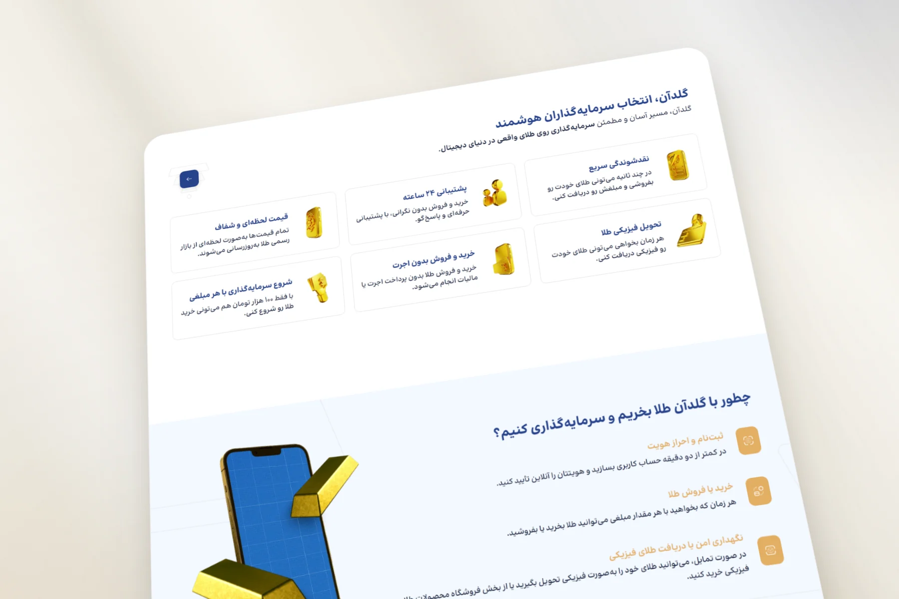
This stretch of the landing page makes the argument before it asks for an account: six reasons to buy here — quick liquidity, support around the clock, transparent prices, physical delivery, no making charge, and a start from any amount — and then the three steps from opening an account to holding the gold.

GoldOn — At phone width

06At phone width

The screens shown here are the landing page, the dashboard home and the shop at phone width. At this width the hero restacks with the gold above the price and its buy and sell tabs, the dashboard sidebar steps aside, and the balance cards stack into a single column.

Let’s Stay Connected

Got questions or want to collaborate? Feel free to reach out — I’m open to new projects or just a casual chat.

0%