Visit
Web3

Rifex case study

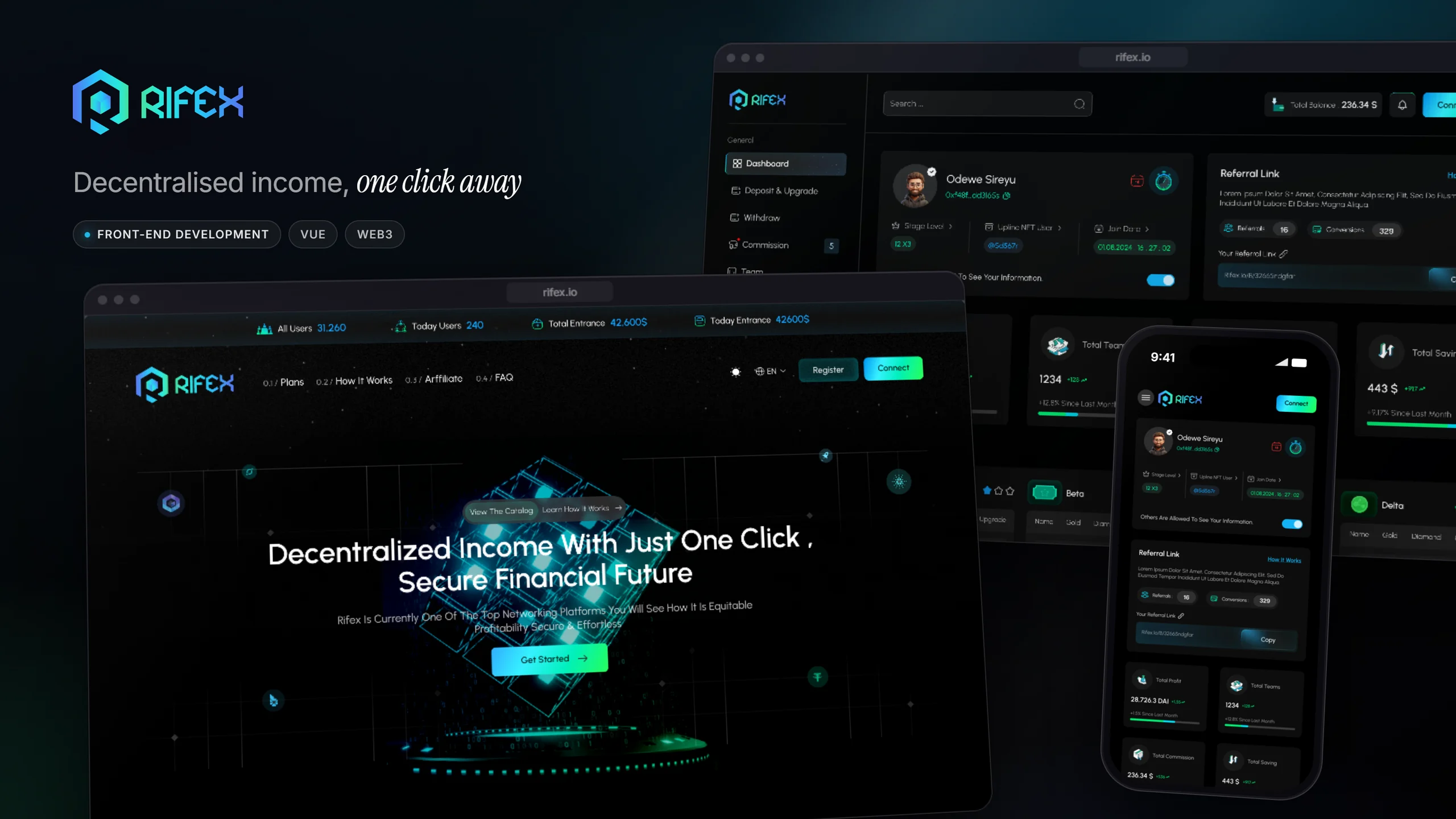
A decentralised income platform: a dark landing page that sells the idea, and a dense, wallet-connected dashboard where members track their programs, team and commission — in dark and light themes.

Role
Front-end developer
Stack
Vue 3 · Tailwind · Pinia · wagmi
Rifex — project overview

01Overview

Rifex runs on smart contracts: a member connects a wallet, registers an NFT username under the person who invited them, and buys into tiered programs that pay out as their network grows. I built the front end — the landing page and the member dashboard, in both themes, from desktop down to phone width. The app reaches the chain through wagmi and ethers, with Reown handling the wallet connection.
02The challenge

The dashboard is where members decide whether to trust the platform, and it is dense: profit, team size, commission and savings, four programs with three tiers each, a stage track, and a live feed of on-chain activity. All of it has to read at a glance without turning into a wall of numbers — and every figure has to look like something you could check on the chain, not a claim.

Rifex — Two themes, one layout

03Two themes, one layout

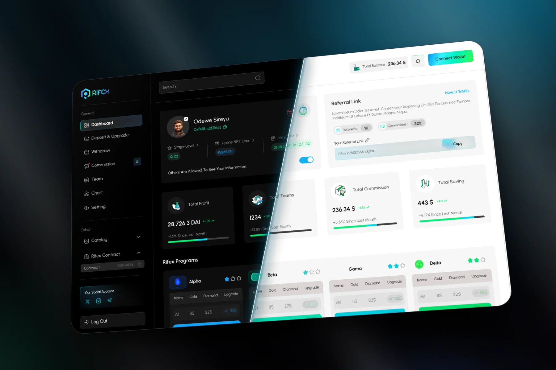
The dashboard shown here is cut along a diagonal: dark build on one side, light on the other. Every card, chart and table keeps its place across the cut — only the palette changes — so a member who switches theme loses nothing they had learned about where things are.

Rifex — A landing page that shows its numbers

04A landing page that shows its numbers

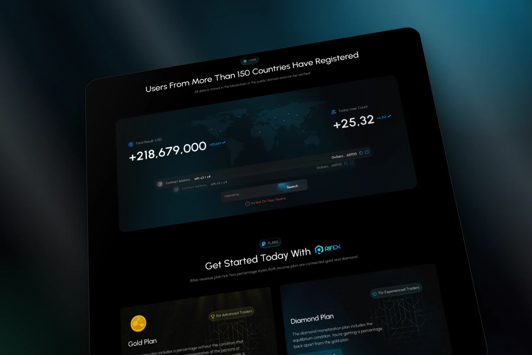
The landing page shown here leads with live figures — the running total in USD and the day's new users — beside the contract address and a search by username, before it gets to the Gold and Diamond plans. The pitch is decentralisation, so the page puts the verifiable part first.

Rifex — Programs and progress

05Programs and progress

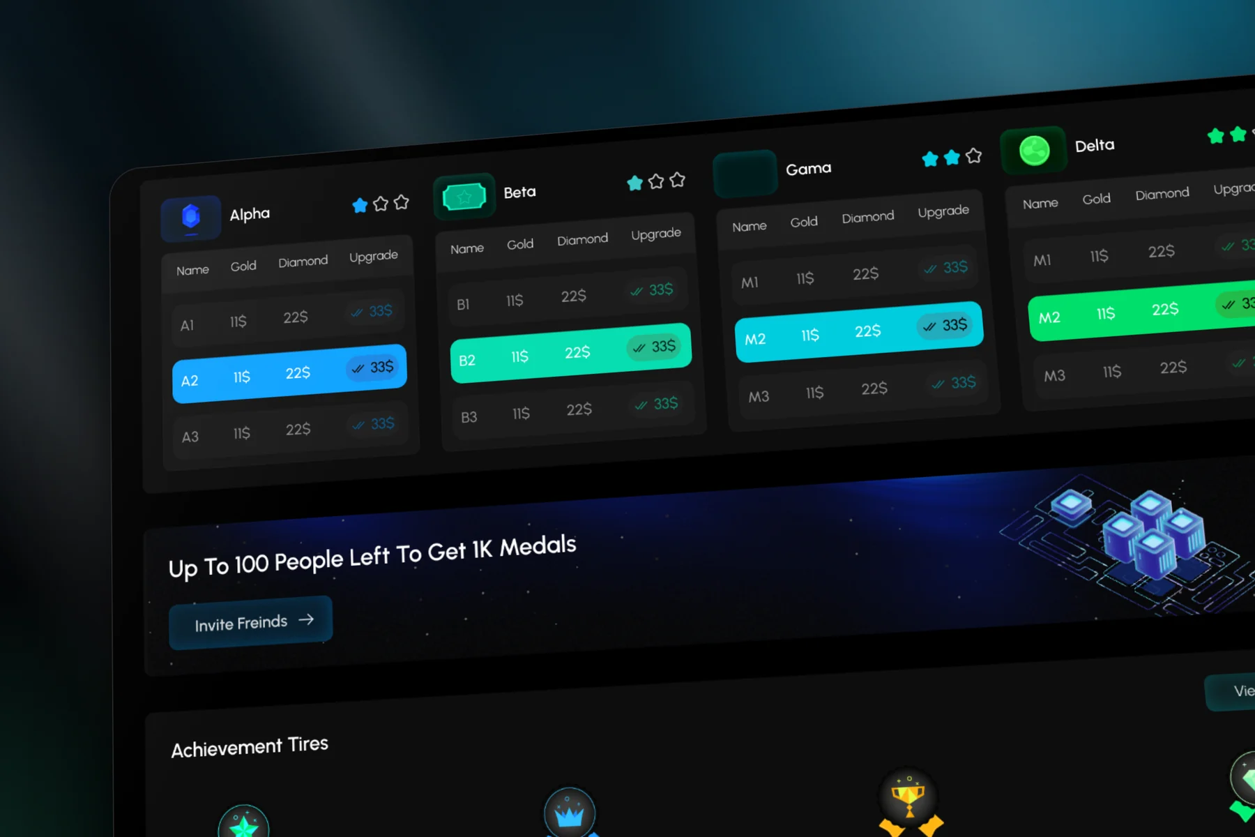
This close-up holds the core of the dashboard: four programs, each with three tiers, the member's current tier lit in that program's own colour, and below it the achievement track from Stage A to Stage D. Colour carries the program, position carries the progress, so the state of an account reads before any number does.

Rifex — The same product on a phone

06The same product on a phone

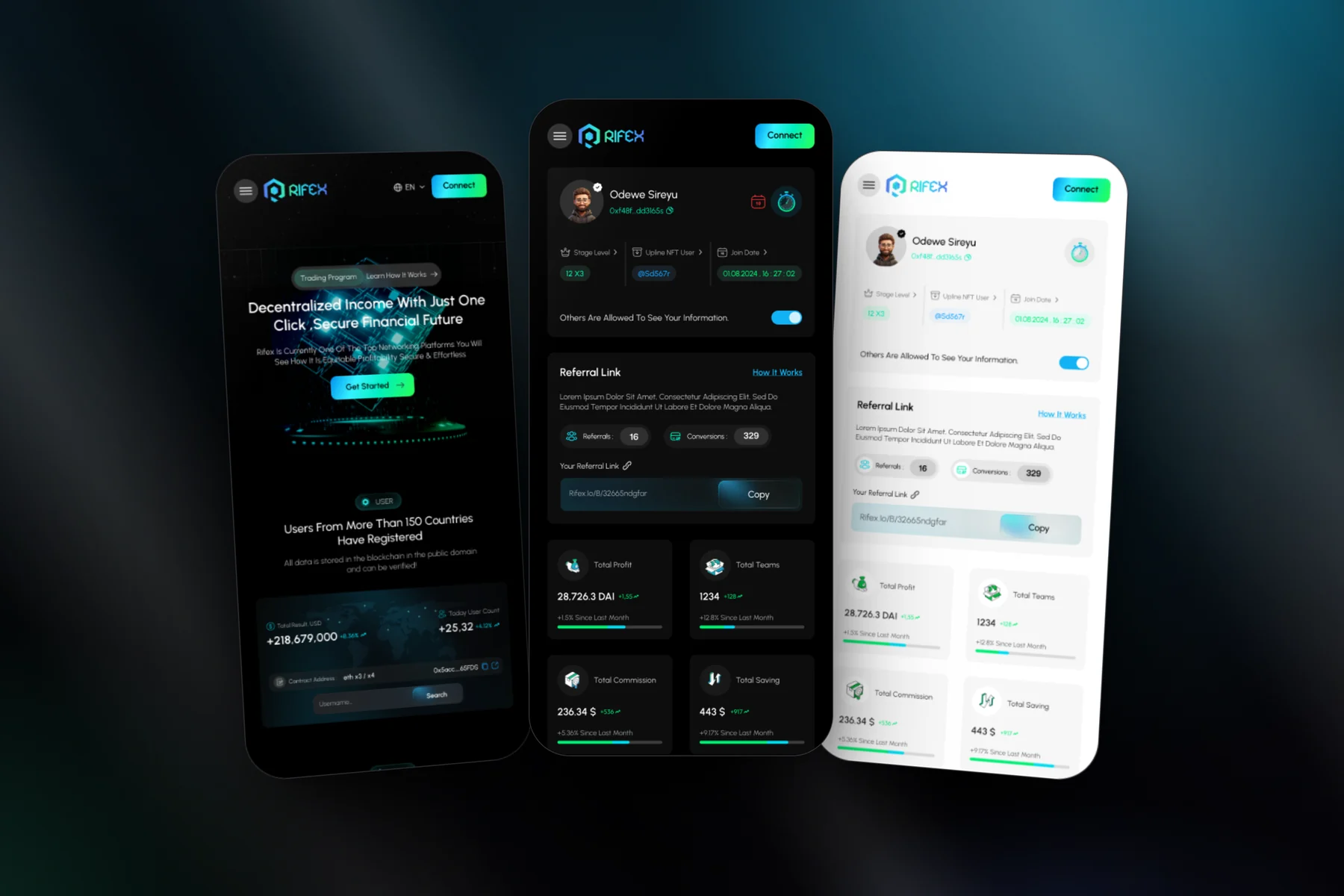
The screens shown here are the landing page and the dashboard at phone width, in both themes. The sidebar folds into a menu, the stat cards restack into two columns, and the wallet button stays pinned in the header, because connecting is the one action every visit starts with.

Let’s Stay Connected

Got questions or want to collaborate? Feel free to reach out — I’m open to new projects or just a casual chat.

0%